Foundations Reference
The Foundations Reference serves as an online version of all the design components to allow both designers and developers to quickly see how a component is made both visually and library-agnostic code.
The Foundations Reference serves as an online version of all the design components to allow both designers and developers to quickly see how a component is made both visually and library-agnostic code.
The date format is conditional depending on the region you are targeting.
When possible, use the month’s full name, for example, October.If there are space
constraints, write dates numerically, for example, 30/09/22.
Names of months and weekdays are written in title case.
| Friday, September 30, 2024 | [day of the week], [Month] [dd], [yyyy] |
|---|---|
| September 30, 2024 | [Month] [dd], [yyyy] |
| 09/30/2024 | [mm]/[dd]/[yyyy] |
| Friday, 30 September 2024 | [day of the week] [dd] [Month] [yyyy] |
|---|---|
| 30 September 2024 | [dd] [Month] [yyyy] |
| 30/09/2024 | [dd]/[mm]/[yyyy] |
Time is always given in a 24-hour or 12-hour format with a colon as the hour-minute separator. Always put a leading zero for the hour so that there are always two digits for both the hour and minute units.
| 09:25 p.m. | [hh]:[mm] [a.m./p.m.] |
|---|
| 21:25 | [hh]:[mm] |
|---|
For label fields referring to numbers, use “#” instead of “No.” or spelling out “number”.
| Bin # | [Label] # |
|---|
background: linear-gradient(333deg, #0094D1 -26.41%, #12329A 115.57%);
background: linear-gradient(321deg, #0096D5 13.36%, #12329A 102.5%);
Below is a type ramp displaying font sizes, line heights and weights. All of these specifications use the Roboto Font.
| Headline 1 | Font size: 48px Line height: 52px |
Roboto • Regular |
|---|---|---|
| Headline 2 | Font size: 32px Line height: 40px |
Roboto • Medium |
| Headline 3 | Font size: 24px Line height: 28px |
Roboto • Medium |
| Headline 4 | Font size: 20px Line height: 24px |
Roboto • Medium |
| Headline 5 | Font size: 18px Line height: 24px |
Roboto • Medium |
| Headline 6 | Font size: 16px Line height: 20px |
Roboto • Medium |
| Subhead 1 | Font size: 22x Line height: 30px |
Roboto • Regular |
| Subhead 2 | Font size: 18px Line height: 22px |
Roboto • Regular |
| Body 1 | Font size: 16px Line height: 22px |
Roboto • Regular |
| Body 2 | Font size: 14px Line height: 20px |
Roboto • Regular |
| Caption | Font size: 12px Line height: 16px |
Roboto • Regular |
| OVERLINE | Font size: 12px Line height: 20px |
Roboto • Medium |
| Button Regular | Font size: 16px Line height: 20px |
Roboto • Regular |
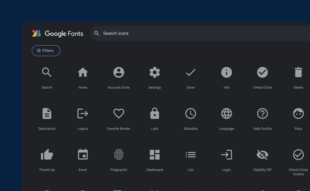
Material design system icons are simple, modern, friendly, and sometimes quirky. Each icon is
created using our design guidelines to depict in simple and minimal forms the universal
concepts used commonly throughout a UI. Ensuring readability and clarity at both large and
small sizes, these icons have been optimized for beautiful display on all common platforms
and display resolutions.
To request or submit additional icons not yet available in the design system, please fill out our feedback form and select "Icon Request" under "What is this regarding?". Please describe what you are looking for and the purpose the icon should serve.
These buttons are used to house the main call to action of a module. Ideally, there should only be one primary button per module, panel, or overlay. Our buttons are flat and have a rounded corner radius of 3.
                                /* Button Base */
.button {
  padding: 10px 40px;
  border: none;
  border-radius: 3px;
  font-family: 'Roboto', Helvetica, Arial, sans-serif;
  font-size: 16px;
  font-style: normal;
  font-weight: 400;
  line-height: 20px; /* 125% */
  letter-spacing: 0.1px;
  text-align: center;
  text-decoration: none;
  white-space: nowrap;
}

.button:hover, .button:active {
    transition: all 0.3s ease-in-out
}

@media (prefers-reduced-motion: reduce) {

  .button:hover,
  .button:active,
  .button:focus {
    transition: none
  }
}
class="button btn-primary"
                                        /* Button Primary */
.btn-primary {
color: #FFFFFF;
background: #3071A9;
}

.btn-primary:hover {
color: #FFFFFF;
background: #2A6293;
}

.btn-primary:active {
color: #FFFFFF;
background: #16527E;
}

.btn-primary:disabled {
color: #FFFFFF;
background: #AFAFAF;
}
class="button btn-primary-onDark"
                                        /* Button Primary on Dark */
.btn-primary-onDark {
  color: #005DAB;
  background: #FFFFFF;
}

.btn-primary-onDark:hover {
  color: #005DAB;
  background: #F9FCFF;
}

.btn-primary-onDark:active {
  color: #005DAB;
  background: #F4F9FF;
}

.btn-primary-onDark:disabled {
  color: #64686C;
  background: #E4E5E6;
}
Secondary actions give users an alternative action to the primary button. They consist of a thin border with no fill (with the exception of the interactive states). There can be multiple secondary buttons within a module, but must be acompanied by a primary button.
class="button btn-secondary"
                                        /* Button Secondary */
.btn-secondary {
padding: 10px 32px;
color: #005DAB;
background: none;
border: 2px solid #005DAB;
}

.btn-secondary:hover {
color: #005DAB;
background: #F4F9FF;
}

.btn-secondary:active {
color: #005DAB;
background: #E9F1FB;
}

.btn-secondary:disabled {
color: #AFAFAF;
background: none;
border: 2px solid #AFAFAF;
}
class="button btn-secondary-onDark"
                                        /* Button Secondary on Dark */
.btn-secondary-onDark {
padding: 10px 32px;
color: #FFF;
background: none;
border: 2px solid #FFF;
}

.btn-secondary-onDark:hover {
color: #FFF;
background: rgba(244, 249, 255, 0.20);
}

.btn-secondary-onDark:active {
color: #FFF;
background: rgba(233, 241, 251, 0.20);
}

.btn-secondary-onDark:disabled {
color: #AFAFAF;
background: none;
border: 2px solid #AFAFAF;
}
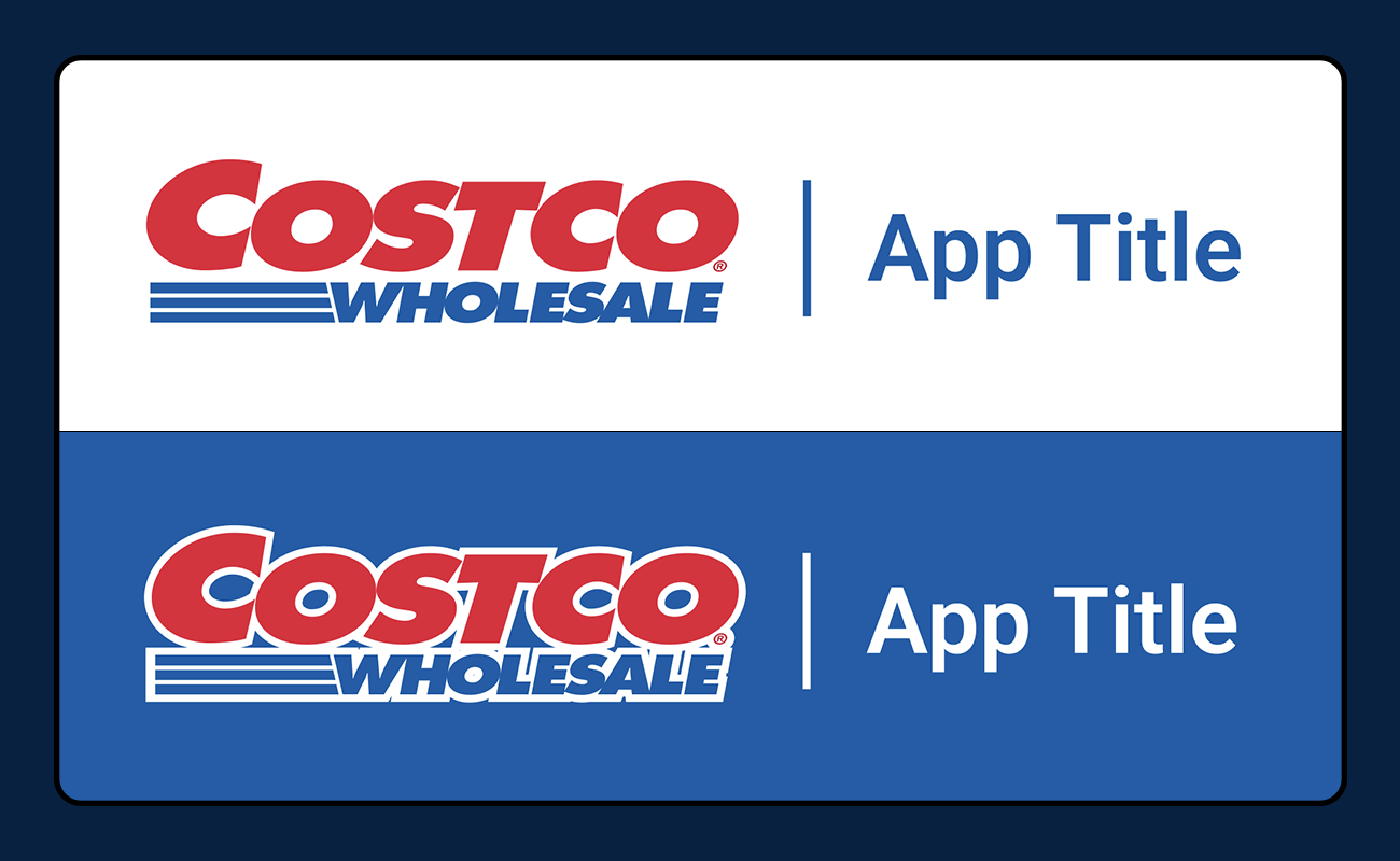
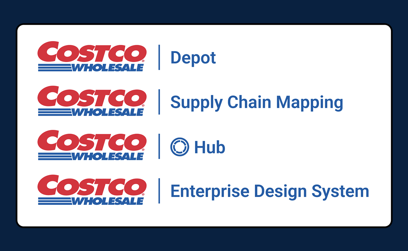
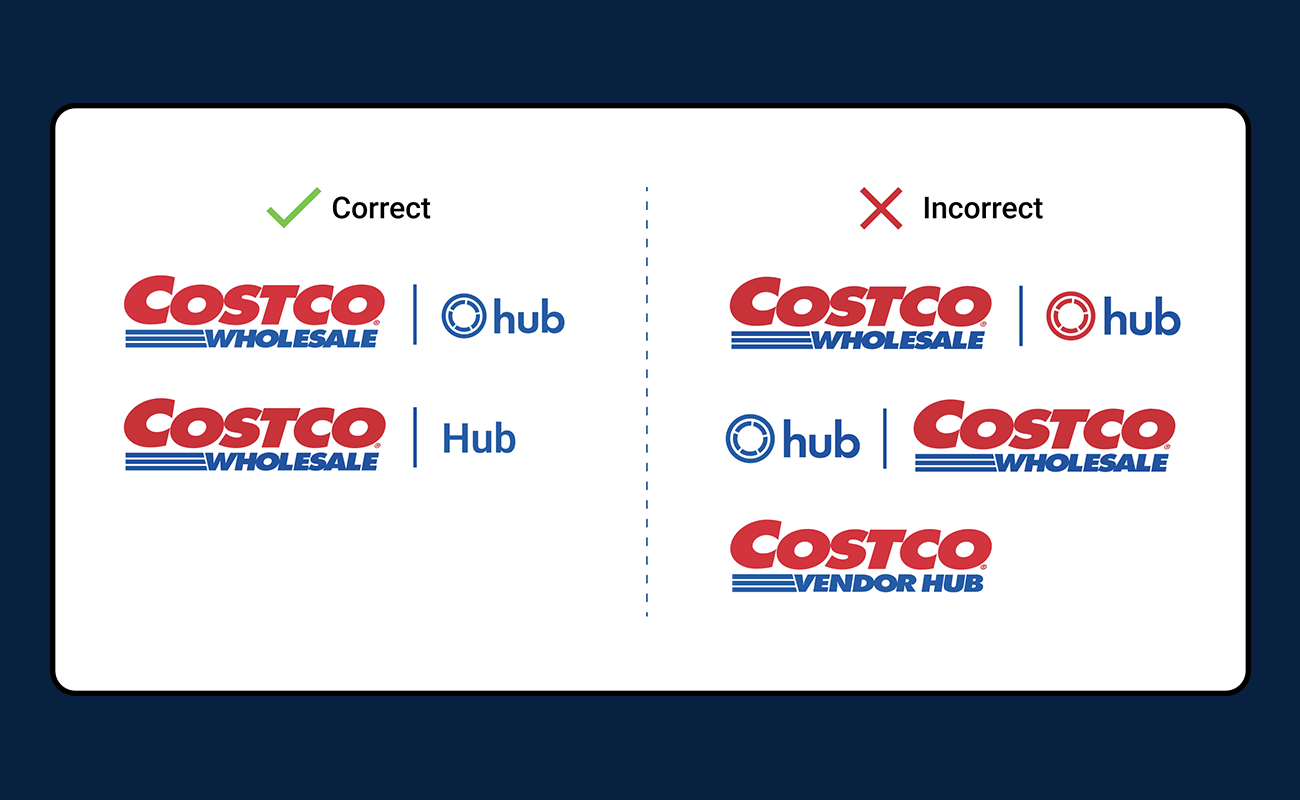
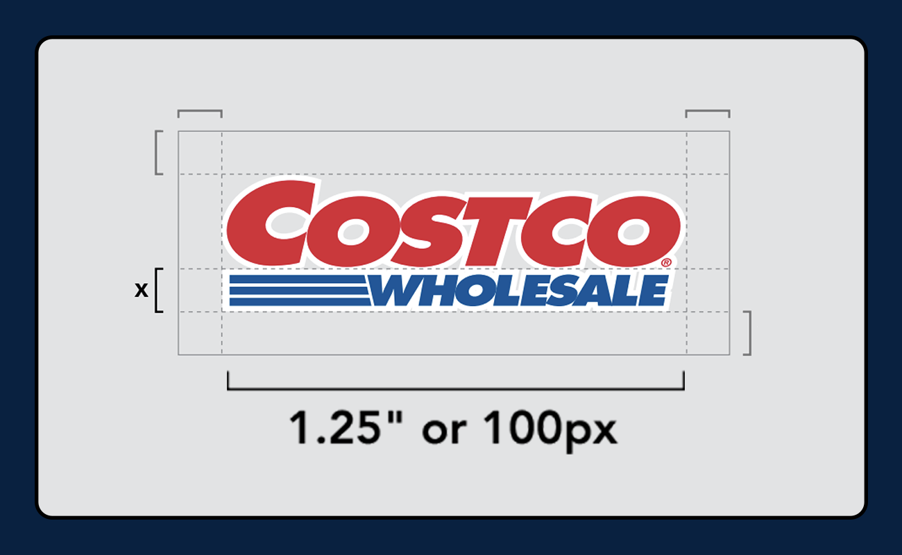
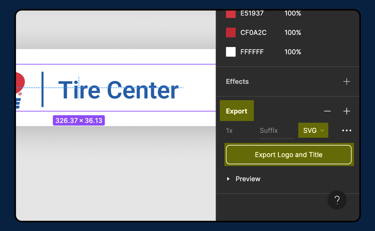
While you will often see Costco sites and applications bearing just the “Costco Wholesale” logo, as the number of internal and external applications continues to expand, it is important to specify to the user which applications they are currently using. This is done by adding each app title to the logo.